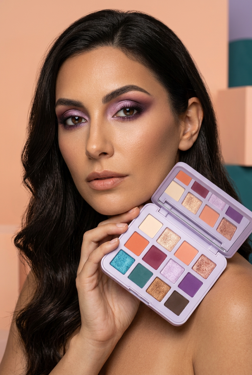
Chromatic Reverie 12-Color Eyeshadow Palette – Peach, Berry, Violet & Teal Mattes and Shimmers in a Lavender Mirrored Compact
Chromatic Reverie 12-Color Eyeshadow Palette – Peach, Berry, Violet & Teal Mattes and Shimmers in a Lavender Mirrored Compact
Couldn't load pickup availability

Chromatic Reverie 12-Color Eyeshadow Palette – Peach, Berry, Violet & Teal Mattes and Shimmers in a Lavender Mirrored Compact
✨ Twelve Shades. A Thousand Ways to Feel Like Yourself.
Some days call for a whisper of champagne. Others deserve a flash of turquoise, a wash of violet, or the warmth of bronze catching the evening light. Chromatic Reverie brings those different moods into one colorful composition: twelve shades, a mix of matte and shimmer finishes, and a clean lavender compact that lets the colors do the talking.
This is a palette concept built around contrast. Soft ivory sits beside luminous champagne. Peach and coral bring warmth, while raspberry and violet introduce depth. Lilac offers a cooler highlight; turquoise and teal open the door to something unexpected. Bronze and espresso connect the brighter colors to familiar, grounded tones. Choose a quiet pairing or let two contrasting shades share the spotlight.
🎨 Meet Your Color Wardrobe, One Row at a Time
Read the palette from left to right, starting at the top. The descriptive shade names below are a guide to the colors, not names printed on the packaging.
The First Row: Light, Warmth & a Little Romance
- Ivory Matte: a pale cream tone for looks that need a light, understated starting point. Pair it with peach for a soft color story or contrast it with espresso.
- Champagne Shimmer: a light golden-beige accent that brings visual brightness to the palette. Try it as the focal shade in a warm neutral look.
- Peach Matte: a warm peach that bridges the gap between a neutral eye and a more colorful direction. It makes a natural companion to coral and rose gold.
- Rose Gold Shimmer: a pink-copper tone with a reflective appearance, especially beautiful in a color story built around peach, raspberry, or bronze.
The Second Row: Your Invitation to Play
- Coral Matte: an orange-leaning coral that brings energy to the warm side of the palette. Use it as inspiration for a sunset-toned eye.
- Raspberry Matte: a rich berry shade that gives pink and purple combinations a deeper anchor.
- Lilac Shimmer: a pale lavender accent with a cool, luminous appearance. Pair it with violet for a tonal look or raspberry for a softer contrast.
- Violet Matte: a saturated purple that turns a simple color pairing into a statement. Keep the surrounding shades quiet when you want violet to lead.
The Third Row: Cool Color Meets Grounded Depth
- Turquoise Shimmer: a bright blue-green accent for those moments when a neutral look needs an unexpected twist.
- Teal Matte: a deeper blue-green tone that creates a tonal partnership with turquoise and an intriguing contrast with bronze.
- Bronze Shimmer: a warm metallic-looking brown that connects the golden shades to the deeper end of the palette.
- Espresso Matte: a dark brown that offers a grounded alternative to the brighter colors. Think of it as the final punctuation in a warm, defined eye look.
🌓 Matte Meets Shimmer: Give Each Finish a Different Role
Color is only half the composition. The matte shades provide the quieter visual surfaces: ivory, peach, coral, raspberry, violet, teal, and espresso. The shimmer shades bring the reflective accents: champagne, rose gold, lilac, turquoise, and bronze. Together, they create a useful contrast between soft-looking color and light-catching detail.
For a balanced starting point, choose one matte as the main color, a deeper shade for definition, and a shimmer as the focal accent. Prefer a more restrained look? Stay within a single color family. Feeling adventurous? Try warm bronze beside cool teal, or let a touch of lilac interrupt a raspberry color story. These are creative suggestions rather than promises of a specific result; your tools, preparation, application, and skin tone will shape the finished look.
🌅 The Peach-Hour Edit
The mood: warm light, a relaxed outfit, and an eye look that feels considered without making color the whole conversation.
- Begin with a small amount of peach and work gradually, using a clean eye brush to soften the edges.
- Introduce coral where you want a warmer emphasis, keeping the placement concentrated rather than spreading every color everywhere.
- Add champagne or rose gold as your light-catching accent.
- Finish with a little espresso near the outer lash area if you want more definition. Keep powder away from the waterline.
The appeal of this combination is its relationship between colors: peach and coral share warmth, champagne adds a lighter note, and espresso creates contrast. Start simply and adjust the balance to suit your own style.
💜 After-Dark Color Notes
Instead of a step-by-step recipe, think in three decisions. Choose your anchor: raspberry for a berry-led look or violet for a cooler direction. Choose your light: lilac creates a tonal contrast, while rose gold introduces warmth. Choose your boundary: keep the color close to the lid for a restrained effect, or explore a broader shape with a clean brush and careful blending.
You do not need to use every shade to make the palette feel expressive. Two colors with a clear relationship can be more striking than six competing ideas. Leave a little visual space around the strongest shade and let it become the focus.
🦚 A Different Kind of Statement: Teal, Turquoise & Bronze
For a less predictable color story, bring the bottom row into the spotlight. Teal and turquoise belong to the same cool family, but their contrasting finishes give them different visual roles. Bronze adds a warm counterpoint, while espresso can keep the overall direction grounded.
Try a small turquoise accent alongside an otherwise bronze-led look before moving into a fuller blue-green composition. If you prefer color in smaller doses, use a precise eye brush to keep the accent close to the outer lash area. Build your idea gradually and follow the application directions supplied with your actual product.
🪞 Color Inside. Simplicity Outside.
The pictured design pairs a pale lavender case with rounded corners, twelve square pans arranged in three rows of four, and a mirror inside the lid. There is no printed logo on the packaging. The result is a deliberately quiet frame around a lively collection of colors.
The organized grid makes the color relationships easy to explore at a glance. The first row introduces light and warmth, the second moves into berry and purple, and the third balances cool blue-green tones with bronze and dark brown. Open the lid and the entire composition is visible together, rather than hidden across separate compartments.
☕ A Small Ritual, Not Another Rulebook
Picture a few minutes at your dressing table before the day begins. You reach for peach because it feels familiar, then notice the lilac beside it. Perhaps today you keep things simple. Perhaps tonight you return to the same palette and choose raspberry instead. The pleasure is in having different directions available without needing to decide who you are going to be for the entire week.
Chromatic Reverie is an invitation to treat color as a personal choice rather than a trend to follow. Match your clothes, contrast them, repeat a favorite combination, or try something you would normally pass over. There is no requirement to make every look dramatic.
💬 A Few Details Before You Choose
How many colors are shown?
The pictured design contains twelve shades in a three-by-four arrangement, including seven matte-looking shades and five shimmer-looking shades.
Does the packaging have a logo?
The packaging in the images is intentionally unbranded, with a plain lavender exterior and no printed logo.
Are brushes or other accessories included?
No brush or additional accessory is represented as part of this offer. Styling objects in campaign imagery are not included.
Will the colors look exactly the same in person?
Lighting, screen settings, skin tone, and application can change how a color appears. Product imagery provides a visual reference, not a guaranteed match on every screen or complexion.
What should I know about the images?
These are AI-generated concept images, including the model portraits. They illustrate the proposed palette design and creative styling, not tested application results. Confirm the actual supplied product, shade layout, ingredients, labeling, and specifications before purchase.
🌈 Find Your Next Color Story
Start with a familiar neutral. Add a warmer note. Discover what happens when lilac meets berry, or when bronze sits beside teal. With its colorful twelve-shade composition and simple lavender presentation, Chromatic Reverie brings several distinct creative directions into one design.